
How might we make complex information easier to understand?
About
As much as I enjoy working with typography, visuals break a complex idea into parts an audience can take in, and they lower the cognitive load of getting there. Information graphics can educate and carry information, and — most importantly — they can show the relationships between data and themes that an audience needs in order to make sense of it. Whether you are breaking down your own research findings or passing knowledge on to someone else, information graphics use type, image, color and compositional flow to do more with less.
role
information design and art direction
Spatial Data at Airports
Strategies for Spatial Data Maintenance at Airports is a four-institution study of how airports collect, validate and maintain the geospatial data their operations depend on, published by the Transportation Research Board of the National Academies of Sciences, Engineering and Medicine as ACRP Project 09-23.
I designed the guidebook’s full design system — color, type and graphic style across every information graphic in it — and laid out the publication itself. The figures shown here are a selection from that system.
The headings are set in Frutiger, the typeface Adrian Frutiger designed for the signage at Charles de Gaulle Airport. The icons follow the symbol system AIGA developed for the U.S. Department of Transportation, the standard in American airports and transit for fifty years. And color does structural work as well as setting tone. All three run on the same rules — simple shapes, a consistent line weight, a single perspective — and those rules are what hold every piece of data in the book together.
Project team
University of Kentucky Hala Nassereddine, PhD · Amin Khoshkenar
Syracuse University Baris Salman, PhD · Michael Ammoury, PhD · Renée Stevens
Endpoint Intelligence LLC Randy Murphy
HDR Engineering, Inc. Jason Singleton, GISP · Mark Day, PE, AAE
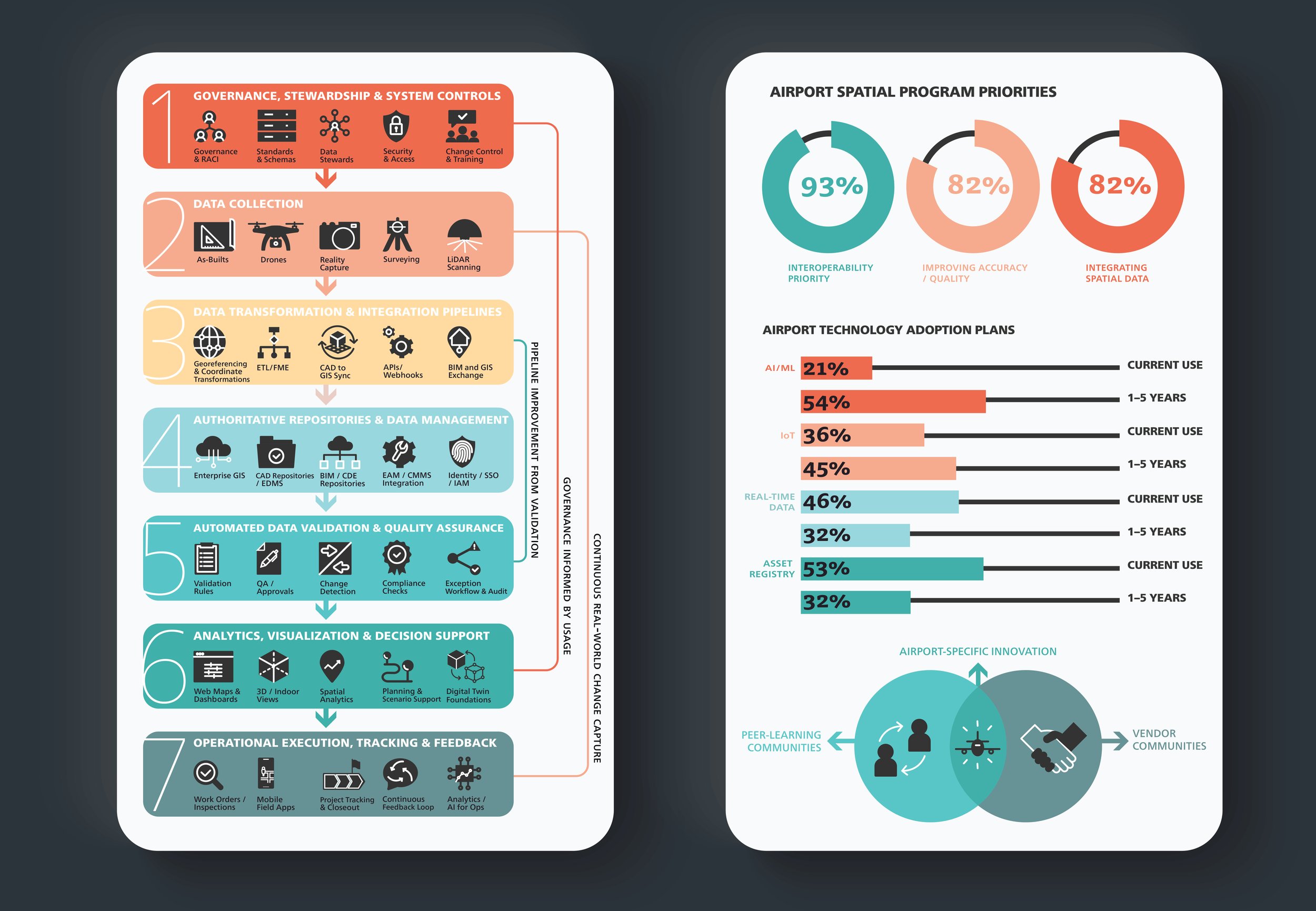
Strategies for Spatial Data Maintenance at Airports. ACRP 09-23.
Designing Immersive 3D Experiences
Designing Immersive 3D Experiences: A Designer’s Guide to Creating Realistic 3D Experiences for Extended Reality is a comprehensive guide for visual designers making the move into 3D and extended reality (XR) design, published by Pearson in 2021 in the Voices That Matter series.
Showing three-dimensional space on a flat page is hard, so I built a system of lines, arrows and color blocks to carry relative depth through the illustrations and information graphics. Paired with the text around them, the diagrams gave a reader a second way into the topic. As an educator, I think it matters to show, not just tell.
Book team
Author, figure designs Renée Stevens
Executive editor Laura Norman
Development editor Margaret Anderson
Senior project editor Tracey Croom
Copy editor Linda Laflamme
Composition and interior design
Kim Scott / Bumpy Design
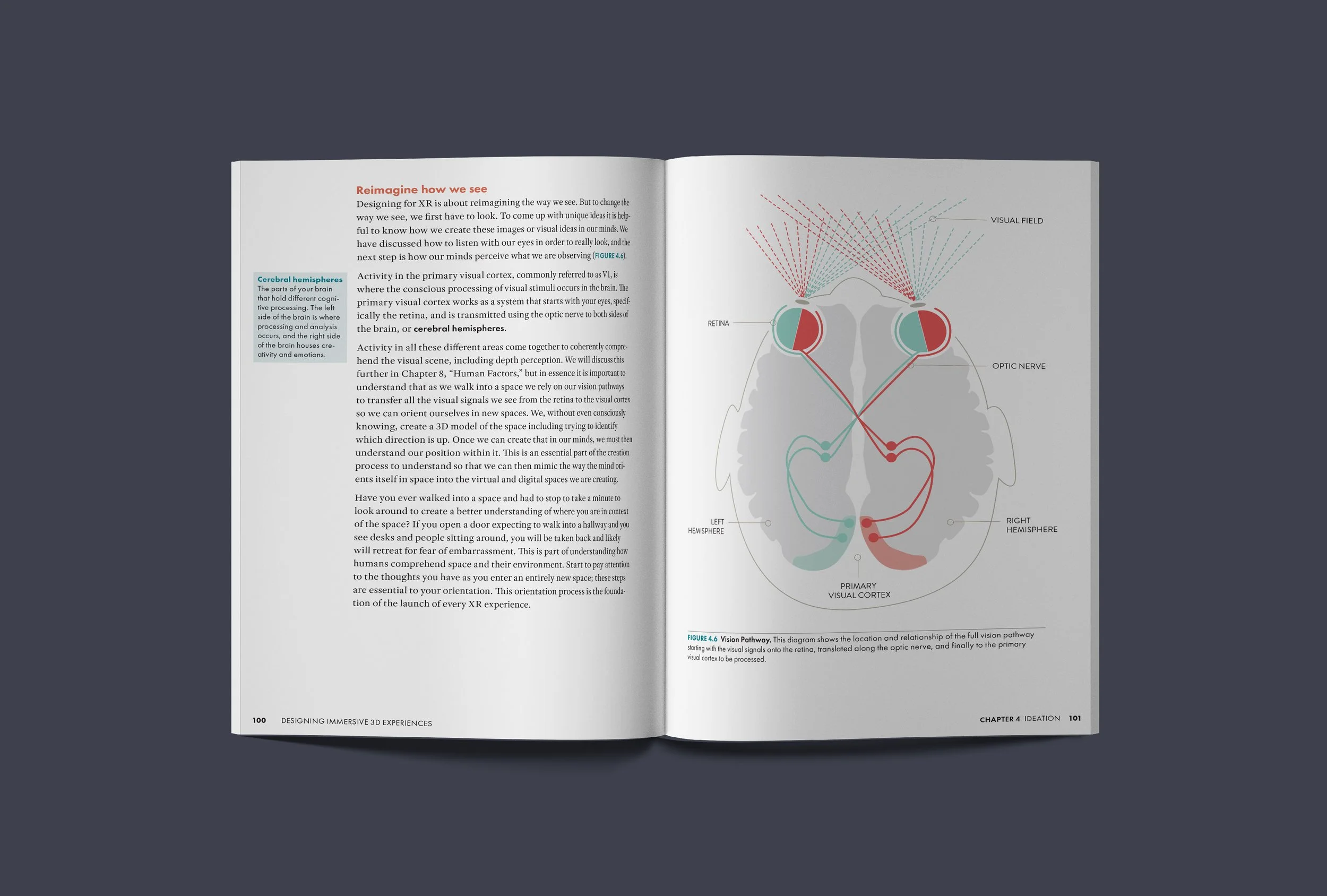
Figure 4.6, Vision Pathway. Chapter 4, Ideation.
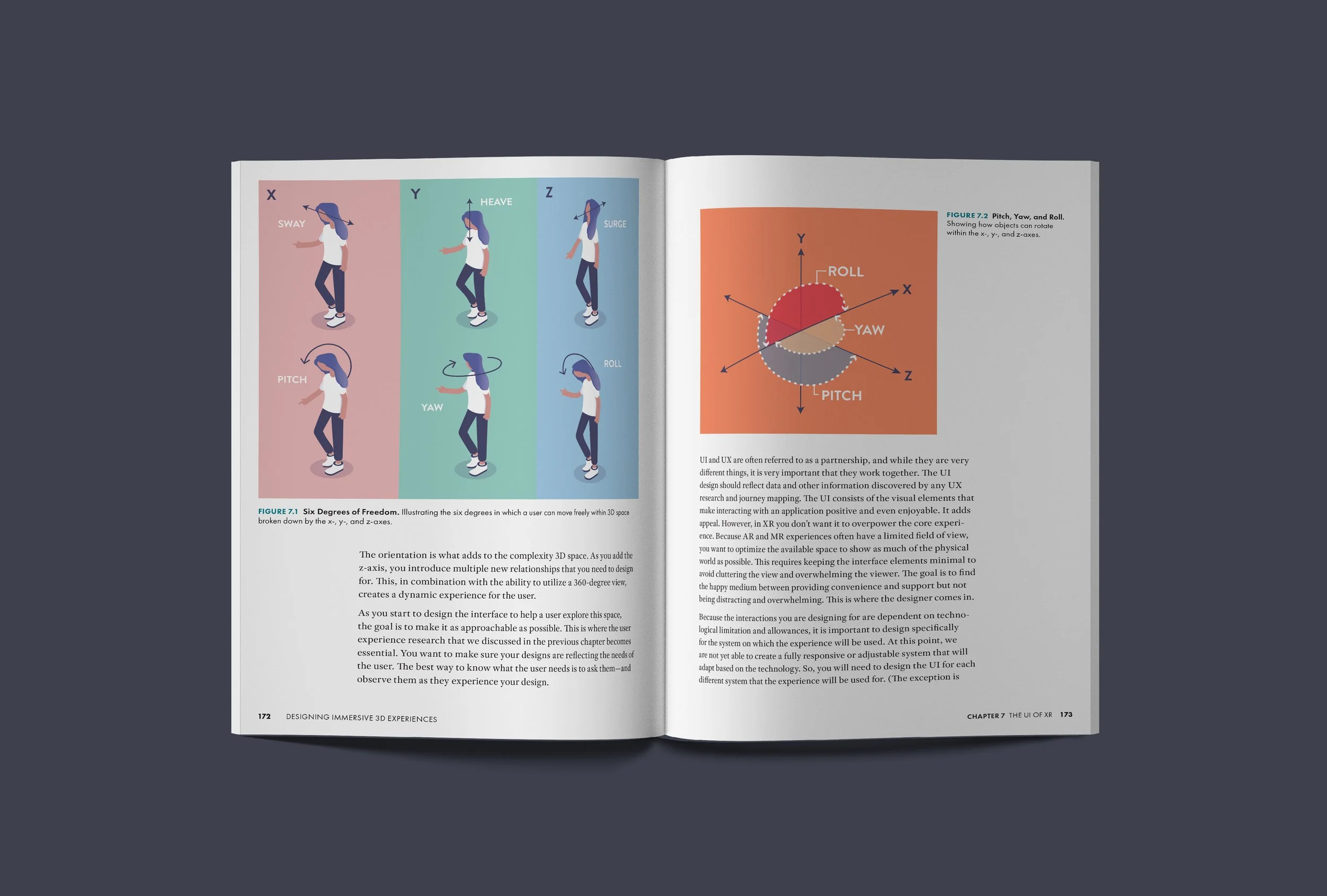
Figures 7.1 and 7.2, Six Degrees of Freedom. Chapter 7, The UI of XR.
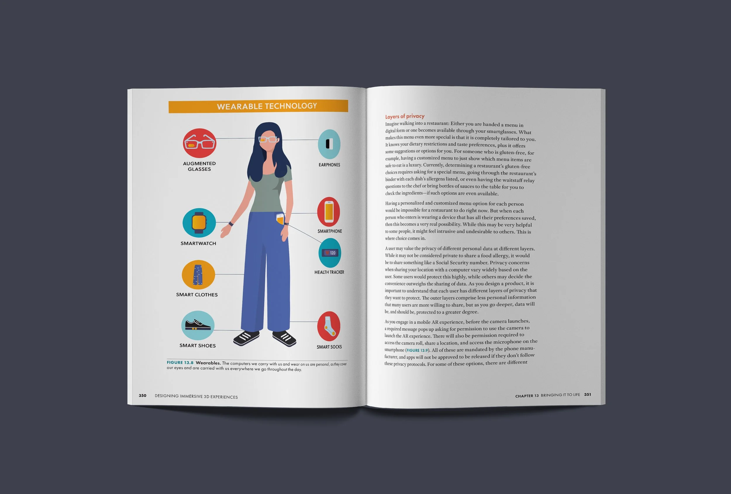
Figure 13.8, Wearables. Chapter 13, Bringing It to Life.



Powered by Design
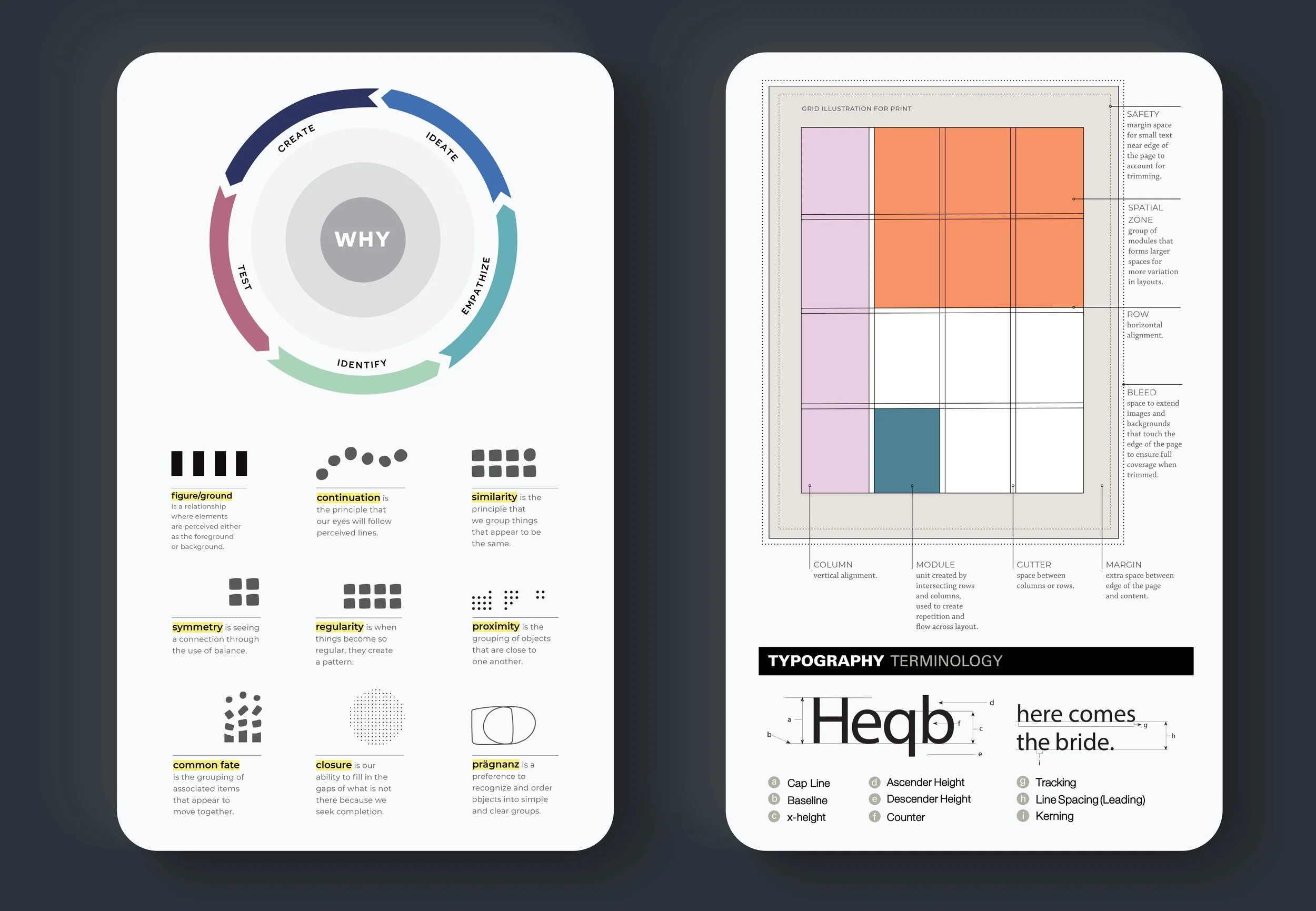
Powered by Design is a book about problem-solving with graphic design, published by Rocky Nook in 2020, where the page layout had to demonstrate the principle it was explaining.
The whole book had to be approachable — the opening spread, the tone it was written in, and everything between its covers. So we broke ideas down into simple shapes. Every page carries images, examples of work from designers around the world, paired with information graphics like the ones shown here that give the text a visual form. Labels and highlighted type are part of that design, so a reader can find what they need as they go.
Named one of the Best Graphic Design Books of All Time by BookAuthority.
Book team
Author, cover and interior design and layoutRenée Stevens
EditorTed Waitt
Project managerLisa Brazieal
Marketing coordinatorMercedes Murray
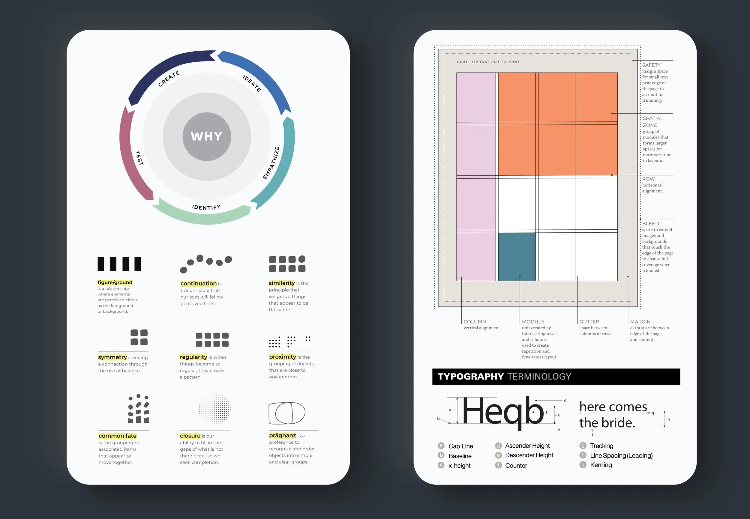
Design process, Gestalt principles, grid anatomy and typographic terminology — a selection of the explanatory graphics from the book.
Perinatal Palliative Care
These designs support research into how families are cared for through a pregnancy with a lethal fetal diagnosis. The work calls for sensitivity and real care. Every conversation with these researchers came back to the same thing: the family and the baby are central to every topic. So the central image — two ungendered parents holding their baby, the baby itself drawn as a heart — recurs across the figures for three publications between 2016 and 2021.
Project team
Saint Louis UniversityDenise Côté-Arsenault, PhD, RN, CPLC, FNAP, FAAN — Hemak Endowed Professor of Maternal Child Nursing
University of Rochester Medical CenterErin M. Denney-Koelsch, MD — Professor of Palliative Care and Pediatrics

Stages and Tasks of Pregnancy with Life-Limiting Fetal Condition — the cycles and stages of grief, with the care teams as the roots, the care coordinator as the trunk, and the family held in the crown.
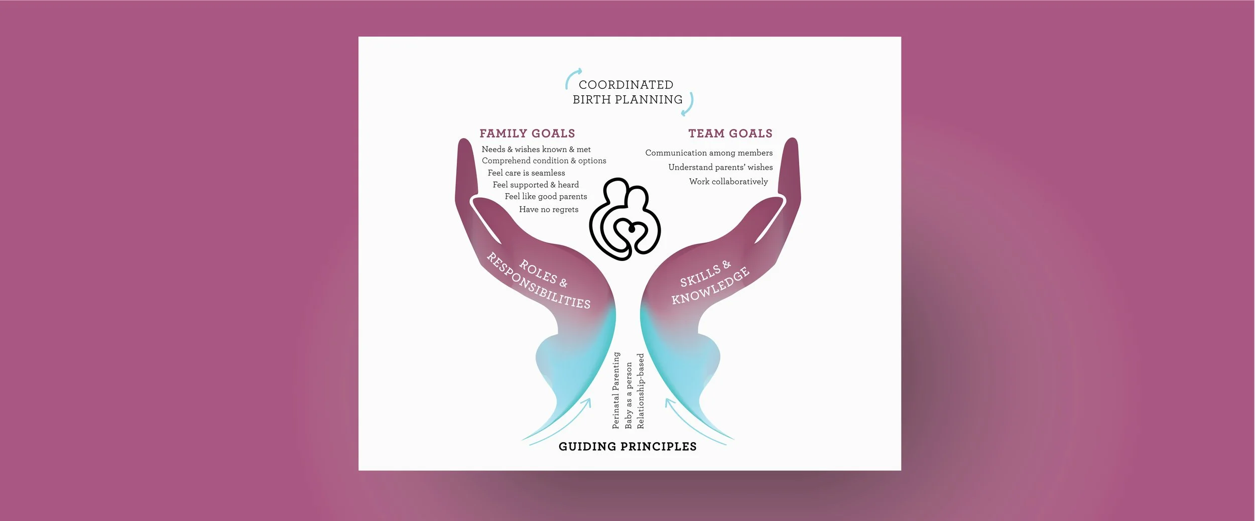
Create a Safe Space. From “Creating a Safe Space,” International Journal of Palliative Nursing, 2021.
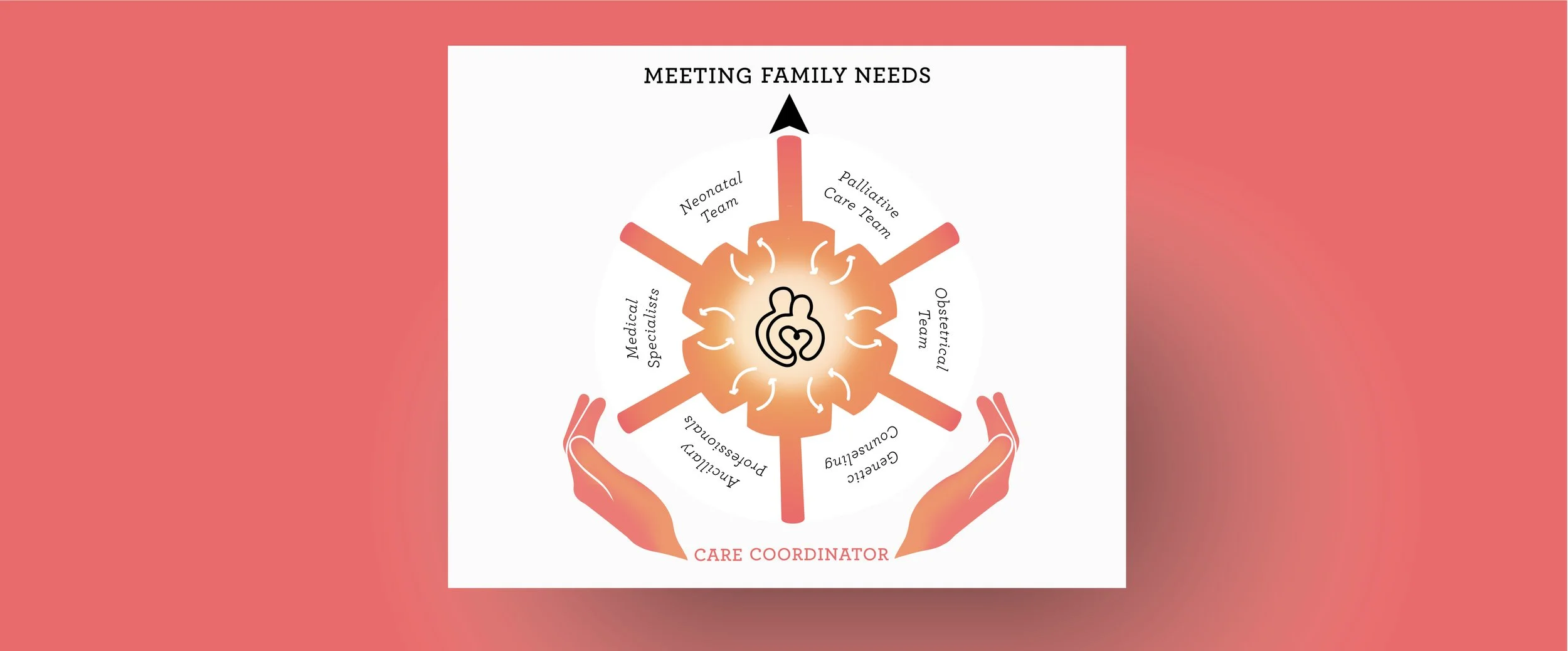
Perinatal Palliative Care Coordinator as Navigator — the figure carried by all three publications. From “Creating a Safe Space,” International Journal of Palliative Nursing, 2021; Perinatal Palliative Care: A Clinical Guide, Springer Nature, 2020; and “Have No Regrets,” Social Science & Medicine, 2016.
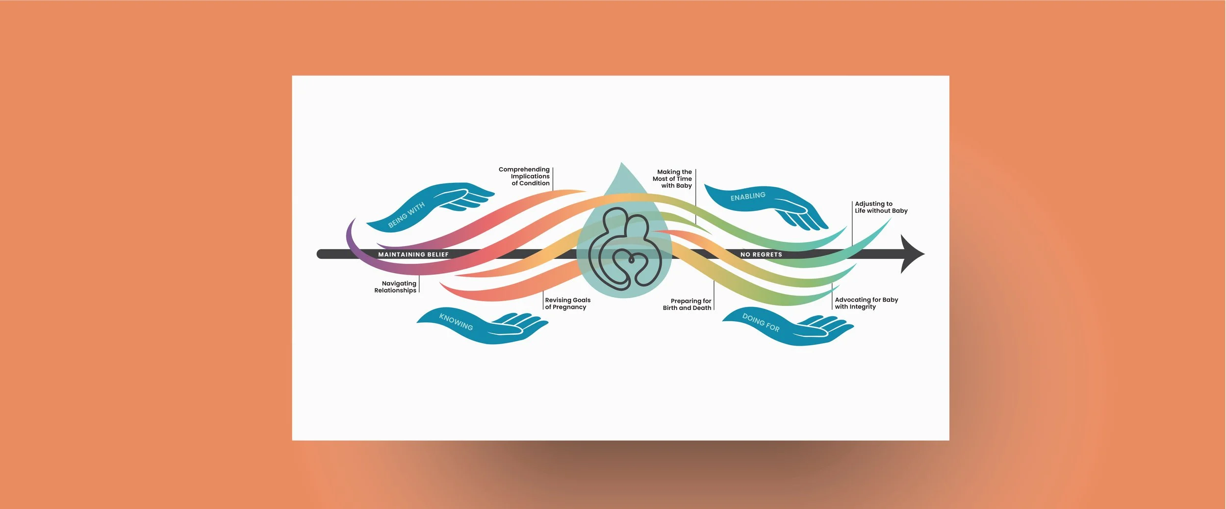
Have No Regrets, Perinatal Palliative Care Pilot Study — the newest of these, and the one that brings the whole body of research into a single graphic.